This is a sandbox demo. It is intended to help you explore a specific TwikBot concept in isolation, using a pre-built product graph you can inspect and experiment with freely.
Overview
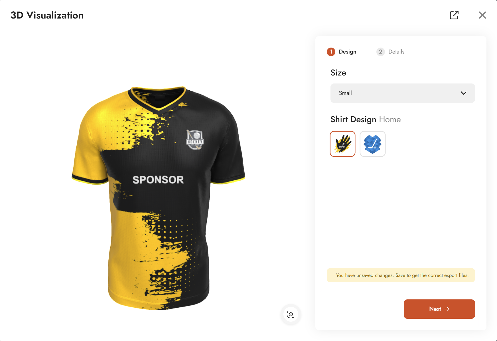
UI Basic - Demo is a showcase of the most common UI input types available in TwikBot. Rather than focusing on a single concept, this demo places several input types side by side so you can see how each behaves and when to use one over another.
The demo uses a sports jersey as its subject and is organized into two configurator steps: Design and Details. Together they cover option lists in three different display modes (icon picker, dropdown, and radio button), numeric inputs with min/max and step controls, conditional visibility driven by a string query, and a text input with validation options.
Product graph
The graph file for this demo can be downloaded and imported directly into TwikBot Create.
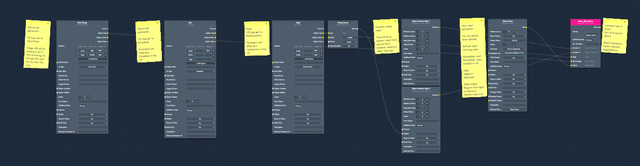
Nodes used
|
Node |
Reference |
Purpose |
|---|---|---|
|
Option List — Shirt Design |
An icon picker with image URLs as icons. Demonstrates how to use image-based icons instead of color swatches. |
|
|
Option List — Size |
A dropdown selector. Demonstrates the dropdown UI type as an alternative to the icon picker. |
|
|
Option List — Digit |
A radio button selector used to choose between a single or double player number digit. Also drives the conditional visibility of the second numeric input via a String Query node. |
|
|
Numeric Input — Player Number Digit 1 |
A number field for the first digit of the player number. Demonstrates minimum value, default value, and step accuracy settings. |
|
|
Numeric Input — Player Number Digit 2 |
A number field for the second digit. Visibility is controlled by the Digit option list: it only appears when Double is selected. |
|
|
Text Input — Player Name |
A text field for the player name. Demonstrates maximum length, text case enforcement, validation regex, and the Allow Empty setting. |
|
|
String Query |
Evaluates the selected option key from the Digit option list and outputs a boolean. Used here to conditionally show or hide the second numeric input. |
Graph explained
This graph is a side-by-side showcase of input node types rather than a single linear flow. The sections below explain each input type and its key settings.
-
Option List — display modes
The Option List is the most common input type in TwikBot. It supports three UI display modes, all shown in this demo: icon picker, dropdown, and radio button. You can set the display mode via the UI Type field on the parameter. For icons, you can use a color HEX value to show a colored swatch, or an image URL to show a custom icon image. If both are filled in, the image URL takes precedence. You can also set a default value to control which option is pre-selected when the configurator loads. -
Numeric Input
The Numeric Input exposes a number field in the UI. Key settings include minimum and maximum value (in this demo, minimum is set to 0 since negative numbers are not relevant), a default value, and step accuracy which controls how finely the value increments. A step of 1 moves in whole numbers; smaller values like 0.1 allow decimal input. Visibility can be toggled per parameter, which is used here to hide the second digit field by default. -
String Query and conditional visibility
The Digit option list (Single / Double) drives a String Query node connected to its option key output. When the selected option switches to Double, the String Query evaluates to true. This boolean output is connected to the Visible input of the Player Number Digit 2 parameter, making the second digit field appear only when Double is selected. This is the standard pattern for conditional visibility in TwikBot. -
Text Input
The Text Input exposes a free-form text field in the UI. Key settings include maximum length (the maximum number of characters allowed), text case (to force uppercase, lowercase, or leave it free), validation regex (to restrict which characters are accepted), and Allow Empty (to require the user to enter text before proceeding). These settings are the same as in the Personalization Basic demo, but shown here alongside the other input types for comparison.